
The Origin of our Brand Mark
An ancient Chinese coin and Secrid - what's the connection?
Our founder, René van Geer, has been intrigued by the double-sided nature of the Qian coin for some time. So much so that our new brand mark has been based on it.

Secrid’s symbol
Thinking of a symbol that could represent the essence of Secrid, our founder René van Geer drew inspiration from an ancient Chinese currency. Perhaps you are familiar with it; the Qian coin has a straightforward yet recognisable shape, being a round coin with a square hole in the centre.
This coin carries depth and meaning, despite its simple appearance. For instance, beyond its practical purpose, the coin also serves as a yin-yang symbol. Its round shape signifies yang (the heavens), while its square hole embodies yin (the Earth). Additionally, the coin represents the value of things and simultaneously symbolises energy.
René recognised the coin’s powerful shape and duality could fit the essence of our brand nicely: on the one hand, Secrid offers high-quality, practical pocketwear. On the other hand, we aim to inspire: spending your money consciously can genuinely contribute to a more responsible society and a better environment.
Inspiration for the heptagon
The number seven plays a particular role in our company. This is especially true in our product design. In this process we constantly make choices. Sometimes this relates to the shape of a component - in other cases, we face dilemmas concerning, for example, the use of leather. We approach each dilemma from several different angles to ensure we have made the best possible decision. To assist with this, we have developed seven holistic design principles.
The brand mark represents the seven angles we use in our product design
Circling back to René’s research, he combined the seven perspectives with the coin's dual geometry. Thus, the concept of a rounded, seven-sided shape —a heptagon— for our brand mark was born.
Our brand mark: what do you see?
Visually, the brand mark consists of two heptagons that form a solid ring enclosing an open centre. These heptagons are rotated 180 degrees relative to each other. This creates vertical symmetry while also delivering a dynamic effect. A detail that isn't immediately apparent is that the surface areas of the ring and the centre are equal. This aspect alludes to the concept of a yin-yang symbol.
Our brand mark: what does it say?
The brand mark represents the seven angles we use in our product design. The solid ring depicts matter, and the open centre stands for the underlying idea. It's important to note that neither element has priority over the other, as product creation is an ongoing, circular process of back-and-forth between idea and matter.
The brand mark highlights balance in another sense as well: it's thin enough to represent Secrid's refined, flat products, yet thick enough to convey their robustness. The ring's radius is small enough to maintain a potent basic form, while large enough to express softness, a natural character, and an association with a circle.
Brèves
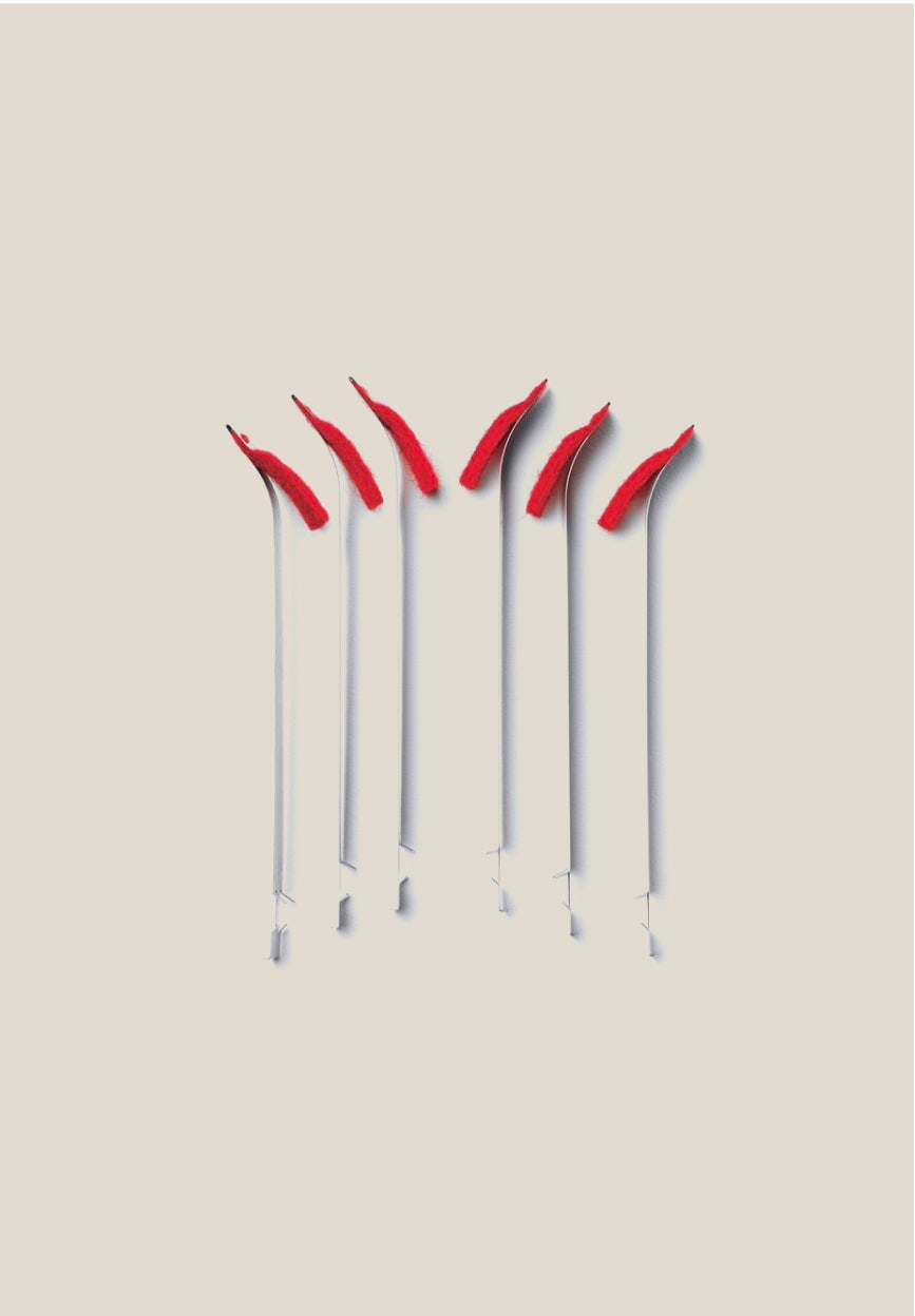
L’attrait des petites choses
C’est l’heure du déjeuner. René, le cofondateur de Secrid, n’est pas au bureau avec son équipe, mais chez lui dans son salon, avec ses parents, Gerrie (81 ans) et Joop van Geer (91 ans). Nous parlons de la relation entre le père et son fils, de la manière dont il lui a insufflé son inspiration, ainsi que de la conception du ressort du Cardprotector.

Valoriser les capacités : secrid et les entreprises adaptées
Depuis 15 ans, nos équipes au sein d’entreprises adaptées néerlandaises ont joué un rôle central dans les opérations d’assemblage de Secrid.
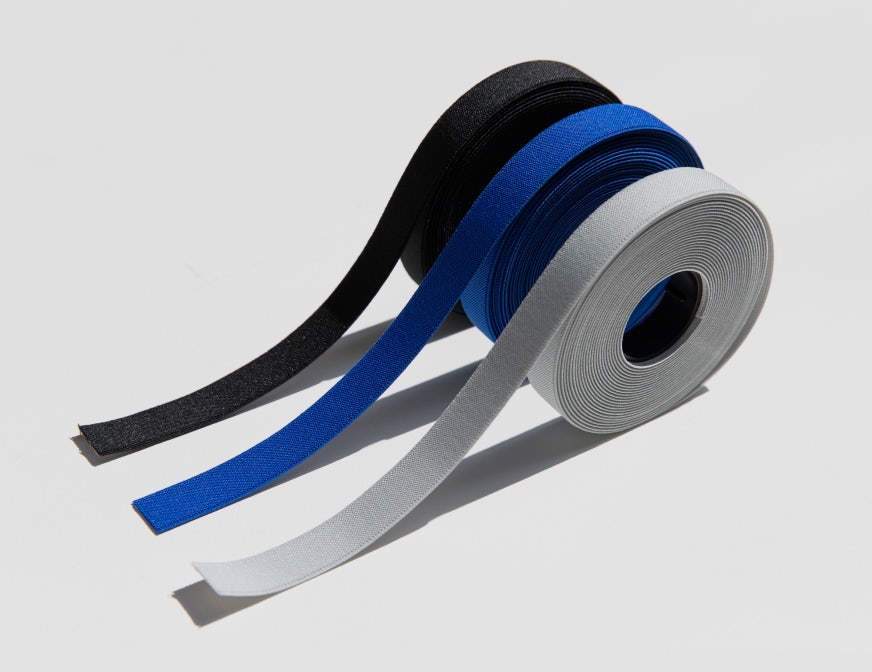
La recherche de matériaux durables
Le Bandwallet en TPU est un porte-carte innovant et durable. Il est conçu avec de solides soudures sans coutures et s’inspire des vêtements de travail. Fonctionnalité et esthétique fusionnent littéralement dans le nouveau Bandwallet en TPU.
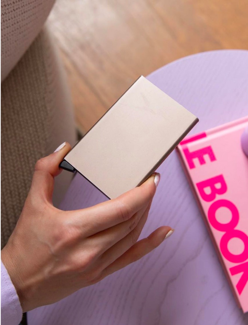
Faites connaissance avec la communauté Secrid !
Je suis toujours un peu dans la lune et désordonnée et j’égarais tout le temps mes cartes. Le Cardprotector était donc le cadeau idéal pour m’aider à mettre mes cartes en sécurité.
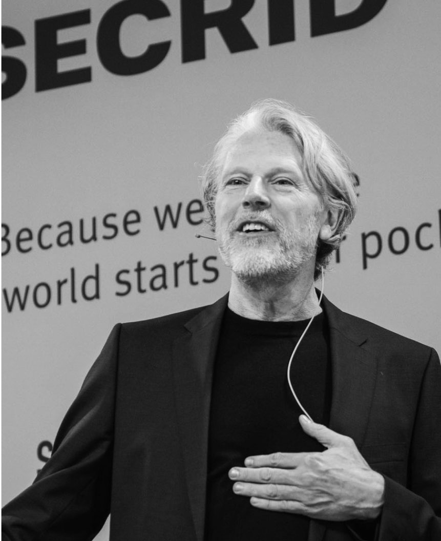
L’Évolution industrielle
Fini le toujours moins cher pour une qualité toujours moins bonne. L’heure est venue de concevoir de nouveaux produits intrinsèquement meilleurs, plus durables et de plus grande valeur que leurs prédécesseurs.
Secrid est une B Corp
Les entreprises certifiées B Corp ne visent pas à générer coute que coute un profit maximum. Elles se différencient de la majorité en ce qu’elles tiennent compte avant tout de leur impact sur les humains, la nature et la planète.

